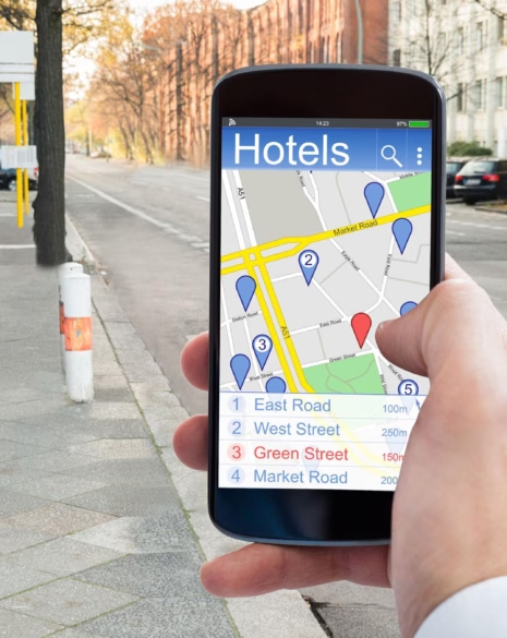
When it comes to converting online traffic into direct bookings, your hotel’s landing page is make or break. It’s the page where curious browsers become committed guests — or where they slip away to a competitor or OTA. And yet, so many hotel landing pages miss the mark. They might be visually striking, but they fall short in guiding users toward action.
At Formula, we know that great design is only half the job. To convert consistently, your landing page needs to combine hospitality warmth with hard-working UX. Let’s unpack exactly what that looks like.
What Makes a Hotel Landing Page “High-Converting”?
A high-converting hotel landing page doesn’t just look good — it functions with purpose. It’s built to remove doubt, speed up decision-making, and lead the guest toward one clear next step.
That might be:
- Booking a room directly
- Making an enquiry (e.g. weddings, meetings)
- Downloading a brochure
- Signing up for an offer or promotion
Every visual element, piece of copy, and interactive feature should serve that primary goal. That means fewer distractions, stronger trust signals, and a mobile experience that doesn’t fall apart under pressure.
The Essential Ingredients of a High-Converting Hotel Page
Let’s walk through the foundational elements that make a hotel landing page not just beautiful, but effective:
1. A Guest-Focused Headline
Instead of stating your hotel’s name or location, lead with the experience. What makes staying here special? “Wake Up Beside the Thames in Boutique Comfort” is more evocative than “Welcome to Riverside Hotel”.
2. Visuals That Build Desire (Without Slowing You Down)
Your images should show real rooms, guests, and moments — not generic stock photography. Optimise every image for speed (WebP format, lazy loading) to avoid compromising performance.
3. A Clear, Compelling CTA — Above the Fold
The main call to action — like “Book Your Stay” or “Check Availability” — should be visible without scrolling. Don’t bury it in menus or make users guess. If possible, use button colour and positioning to make it pop without clashing with your brand.
4. Trust Builders That Feel Natural
These could be:
- A Tripadvisor rating with stars or badges
- “As Featured In” logos
- A short review snippet with the guest’s name and source
- Booking protection or money-back guarantees
Subtle trust signals throughout the page create confidence and calm friction.
5. Mobile-Friendly Booking Experience
More than 70% of hotel searches start on mobile. If your booking engine isn’t responsive, intuitive, and easy to use with one hand, you’re losing out. Test the full flow yourself — from search to payment — on multiple devices.
6. Real Benefits That Reflect What Guests Care About
Wi-Fi, breakfast, parking, pet-friendliness, flexible cancellation — highlight these in short, digestible ways. Not just as features, but as answers to what today’s travellers value most.
7. Support Without Disruption
If you use live chat, make sure it’s discreet and helpful — not intrusive. Offering a “Need help with your booking?” nudge after a few seconds can work well. But avoid anything that obscures your main CTA or causes layout shift.
Common Mistakes That Lower Conversion Rates
Even the most stylish landing pages can underperform when usability is ignored. Here are a few pitfalls to watch for:
- A cluttered layout with too many competing CTAs
- Copy that talks about the hotel, not to the guest
- Slow-loading elements (like oversized sliders or video)
- Unclear messaging — especially on paid ad landing pages
- Missing urgency or booking incentives (e.g. “Only 2 rooms left at this price”)
- Poor mobile legibility or button spacing
One of the most common issues we see is sites that don’t match user expectations. If someone clicks a Google ad for “Brighton seafront hotel deals”, they expect to land on a page that speaks directly to that — not your generic homepage.
Tailoring Landing Pages for Campaigns
Campaign-specific landing pages are a smart way to improve performance from paid traffic or seasonal offers. Instead of driving all visitors to your homepage, consider creating standalone pages for:
- Wedding venue enquiries
- Christmas or summer offers
- Corporate bookings
- Specific regional keywords (e.g. “dog-friendly Cotswold hotel”)
These pages should be tightly focused, stripped of unnecessary navigation, and built to convert that audience. Match the headline and CTA to your ad or email campaign, and track results via GA4 or a heatmap tool like https://www.hotjar.com.
Final Thoughts
A high-converting hotel landing page doesn’t happen by accident. It’s the result of smart design decisions, guest-centric copy, and seamless performance — all working together to guide the user from curiosity to commitment.
It’s easy to get distracted by aesthetics or design trends, but your landing page should first and foremost make booking easy. The more friction you remove, the more trust you build — and the more guests you welcome through your doors.
If your current landing pages aren’t converting as well as they should, we’d love to help.