The completely redesigned the Megaro Collection website unified six distinct destinations into one seamless digital experience, increasing direct booking opportunities, reducing user friction, and helping guests discover and engage with the full collection – from stays and dining to cocktails, wellness and events
An urban collection unlike any other
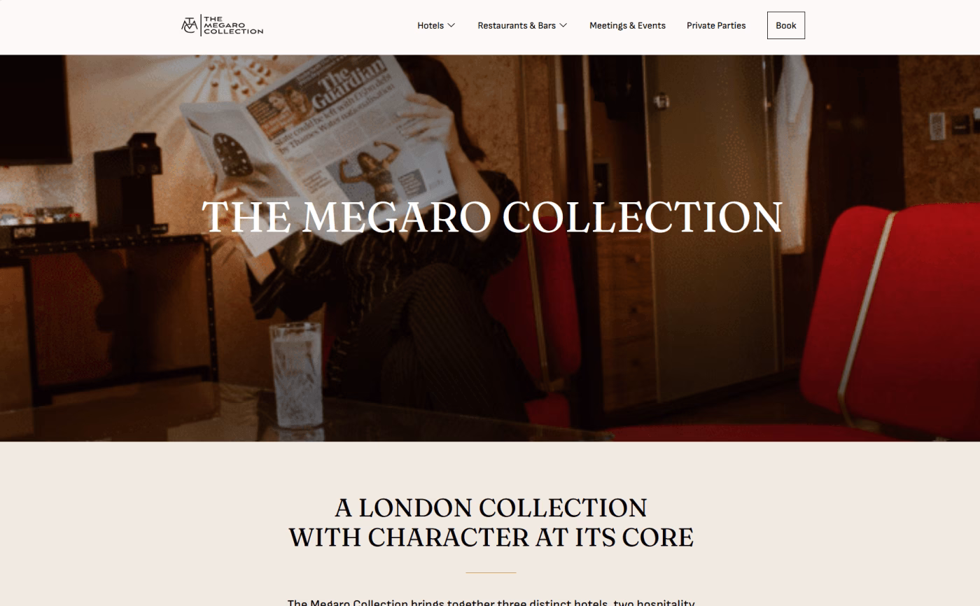
The Megaro Collection is a group of six distinct destinations woven into the fabric of King’s Cross — one of London’s most energised and rapidly evolving neighbourhoods, moments from St. Pancras International.
At its heart sits The Megaro itself: a five-star boutique hotel with a vivid, hand-painted mural façade and individually themed rooms drawing on music, fashion, design and cinema. Bold without being brash. Expressive without being exhausting.
The wider collection extends this personality across two further hotels, a modern Italian restaurant, a craft cocktail bar and a suite of event and meeting spaces – each with its own character, all connected by intelligent design and a deep sense of place.
The challenge was a website that could hold all of this and convert visitors into guests.
What they needed
The existing site was struggling to communicate the richness and range of the collection — and was leaking potential direct bookings to OTA channels. The brief was clear, and the stakes were real:
- Increase brand awareness and direct customer engagement. Make it explicitly clear to guests that booking direct means the best rate — and make that path frictionless
- Promote all services and products – Surface the full breadth of the collection — all three hotels, Spagnoletti, Hokus Pokus, wellness and events — in a way that feels coherent, not cluttered.
- Simplify the user experience by reducing cognitive load, streamlined navigation, and design journeys that guide visitors naturally toward conversion.
- Cross-sell experiences – Integrate Spagnoletti and Hokus Pokus into the guest journey – before, during and after their stay – rather than treating them as separate afterthoughts.
What we Found
The individual hotels’ websites were operating as isolated silos online. The collection’s shared identity – intelligent design, King’s Cross energy, warm hospitality – wasn’t being communicated as a unified whole. Guests were missing the bigger picture.
A significant share of traffic arrived on mobile, but the existing sites were designed from the desktop out. Navigation was cumbersome, booking flows were lengthy, and the visual experience didn’t do justice to the hotel’s design-led interiors.
Guests weren’t being given a compelling reason to book direct. The best-rate guarantee existed, but wasn’t prominent or persuasive. OTAs were capturing guests who had already visited the website – a fixable problem.
User testing revealed that visitors struggled to understand the relationship between properties, or find what they were looking for. Bounce rates were high at key decision points, suggesting confusion rather than disinterest.
Our Delivery
Collection-first architecture
Rather than building six separate microsites, we designed around the idea of one collection with distinct destinations within it. A new homepage introduces the full portfolio, allowing guests to self-select their experience without losing the individual character of each property.
Direct booking at every touchpoint
We embedded the direct booking value proposition throughout the entire site, not just on a rates page. Persistent booking CTAs, rate-match callouts, and direct-exclusive offers make the benefit of booking direct impossible to miss at every stage of the journey.
Integrated experience selling
We mapped the full guest journey – from discovery to post-stay, and identified natural moments to surface dining, drinks and wellness. Spagnoletti and Hokus Pokus appear contextually throughout the stay journey, not as an afterthought on a separate page.
Storytelling that converts
Each page was designed to serve a dual purpose: inspire and inform. Editorial photography, room character narratives and neighbourhood content were woven together with clear calls to action, creating an emotional pull that leads to a booking.
Client Testimonial:
We are happy with the product. We’ve received positive feedback so far, especially on the visual side. Whenever we ask something, there is always an answer and an effort to figure it out — even if it’s a challenging request. Very pleasant, very professional, very effective — and whatever we ask, it’s always ‘okay, let’s try to find a way of doing it.’ Which makes it easy to work together.”